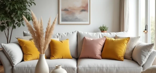
The gray of a sofa is never truly neutral. Depending on whether it leans towards blue, green, or brown, its undertone radically influences the choice of cushions. Starting from this colorimetric data before considering trends or personal tastes avoids many mistakes, as an ochre cushion placed on a bluish gray creates a dirty effect that visual guides can help avoid.
Undertone of gray: the parameter that the cushion color must respect
A cold gray pearl sofa (blue or violet undertone) accepts cool colors and pure whites without creating dissonance. In contrast, a warm gray (beige, taupe, or greenish undertone) calls for warm shades lest it appear dull.
To identify the undertone, a simple test suffices: place a sample of pure white fabric against the armrest in natural light. If the gray appears bluish by contrast, it is cold. If it leans towards yellowish, it is warm. The detailed advice from interior decoration on Inside Out helps refine this diagnosis.
A cushion whose color temperature opposes that of the sofa creates a discordant effect that neither texture nor pattern can correct. This diagnosis conditions everything else.
Cool gray: which cushion colors to favor
Bluish grays (such as steel gray, slate gray) form fluid associations with duck blue, desaturated powder pink, or slightly bluish off-white. Lemon yellow works too, but only as an accent on a single cushion, not as the dominant color of the whole.
Warm gray: successful associations
On a taupe or greige gray, terracotta, ochre, and sage green produce natural harmonies. Black, often recommended as a safe bet, hardens a warm gray without enhancing it. We observe better results with chocolate brown or deep cognac.
Texture and material of cushions on gray sofas: an underestimated lever
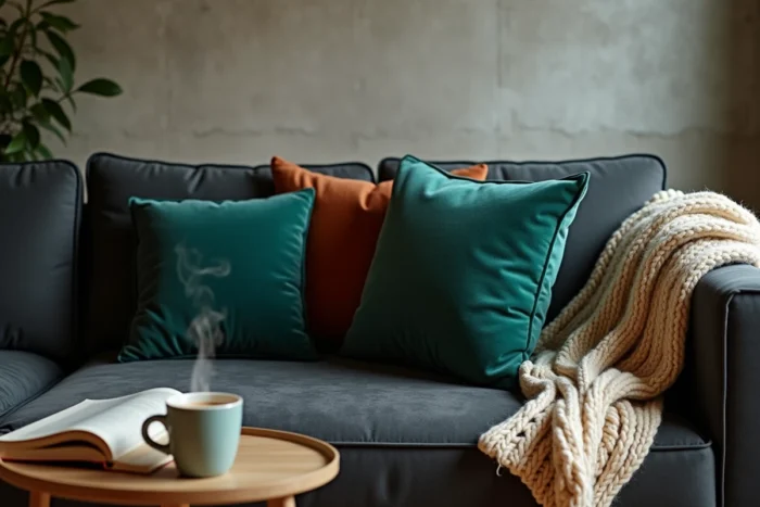
The material structures both the ambiance and the color of the cushion. Current trends confirm the rise of marked textures (corduroy, thick linen, boucle) as a criterion for choice in gray sofas.
A gray sofa in smooth, taut fabric (like microfiber or twill cotton) benefits from cushions in velvet or crumpled linen. The tactile contrast compensates for the visual flatness of the solid gray. Conversely, a sofa that is already textured (boucle, velvet) better supports cushions in washed cotton or fine linen.
- Corduroy: adds depth to light grays, absorbs light on dark grays. To be used sparingly on an anthracite sofa.
- Thick linen or washed linen: ideal for a bright living room, it softens cool grays without adding shine.
- Boucle or boucle wool: creates visual volume, perfect for sofas with straight and minimalist lines.
- Faux leather or vegan leather: provides a radical surface contrast, particularly effective on medium grays with cognac or black tones.
Mixing two different textures among the cushions is sufficient. Beyond three distinct materials on the same sofa, the whole loses coherence.
Number, size, and arrangement of cushions for a controlled look
Color only produces the expected effect if the arrangement is considered. An odd number of cushions (three or five) creates a deliberate visual imbalance that appears more natural than strict symmetry.
On a three-seater sofa, we recommend three to five cushions. On a corner sofa, five to seven. The distribution follows a logic of planes: the largest (about 60 x 60 cm) placed in the corners, the medium ones (45 x 45 cm) in front, and possibly a rectangular lumbar cushion (30 x 50 cm) in the center.
Distributing colors without a catalog effect
The operational rule can be summed up in one sentence: two colors maximum plus one accent. The dominant color occupies the majority of the cushions, the secondary takes one or two, and the accent (the brightest or most contrasting) is limited to a single cushion.
This hierarchy prevents the “sample book” effect where each cushion displays a different shade. The gray sofa, precisely because it is neutral, amplifies chromatic disorder instead of absorbing it.
Trendy colors 2025-2026 for cushions on gray sofas
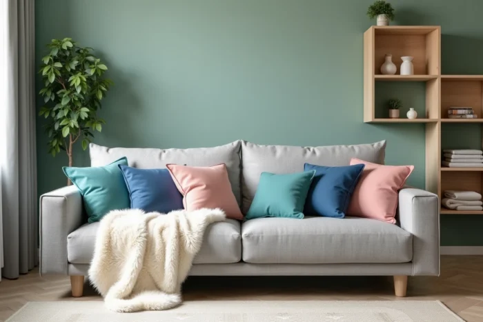
Current palettes mark a clear return of warm colors and natural shades after several years of neutral dominance. Three families stand out for decorative cushions on a gray background.
- Terracotta and ochre: particularly effective on warm grays and medium grays. They warm up the living room without saturating it, especially in linen or matte velvet.
- Sage green and olive green: these muted greens pair well with almost all undertones of gray. They bring an organic note without the acidic side of a bright green.
- Aubergine red and plum: reserved for interiors with few patterns. On an anthracite gray, a plum velvet cushion creates a powerful focal point without resorting to yellow, which is often overused.
Powder pink remains a safe bet on pearl grays, but its omnipresence in catalogs for several years makes it less distinctive. For a living room that doesn’t look like a catalog photo, the terracotta-sage green mix on a medium gray offers a more personal result.
The final choice also depends on the curtains and the rest of the furniture. A cushion is not chosen in isolation: it interacts with the rug, lighting, and wall color. Starting from the undertone of the sofa, choosing two colors consistent with the rest of the room, and then varying the textures – this method produces more lasting results than blindly following seasonal trends.